“You Better El Paso Up” will soon replace “Real Adventure” as Destination El Paso’s new campaign slogan to attract tourism.
“What you are seeing right now with ‘El Paso Up’ is a little bit of a tease of what we’re going to unveil to the El Paso community during National Travel and Tourism Week, which starts May 2,” said Bryan Crowe, general manager for Destination El Paso, the city’s convention and tourism bureau.
“Visit El Paso (one of city’s marketing branches) has been actively engaged over the past 18 months with our agency developing a new campaign related to encouraging the U.S. market to visit El Paso. ‘El Paso Up’ is part of that campaign,” Crowe said.
The true evaluation of a slogan is how well it enforces a product’s brand identity. And there’s the rub. Somehow in the decision-making process, no one has committed to a brand identity.
I suspect it’s because the people who should be defining the brand identity have embraced bullshit. They’re blinded by their own pompous pretension. Maybe they don’t even like El Paso.
The article scrupulously avoided naming the “agency” responsible for the newest slogan, but the campaign has all the hallmarks of Mithoff Burton Partners, the company that gave us the vapid and vacuous “It’s All Good.”
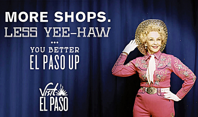
So El Paso Up, y’all. Whatever that means.
This is definitely a new entry for News of the Weird. Who is that? Dale Evans?
“More Commerce,
Less Culture.
Pass Us Up.”
Oof. I agree with you that these people do not like El Paso if the best thing they can see in the city is the fact that it is an urban concatenation with related generic facilities and the slogan they chose less than subtly says “Nothing to see here folks, pass on through.” There’s a strange touch of the return of the repressed in it all, too, though: “Less Yee-Haw,” yet “El Paso Up,” and then there’s the spaghetti western font. The lady in pink is undoubtedly terrifying, demonic but also somehow alluring… intriguing…
Come to think of it, maybe, — just maybe — this is the best goddamn ad for a town I’ve ever seen.